Sometimes companies let technical considerations affect their product strategy in a bad way, allowing “practical” point of view override the “user” point of view. Startups often say “our technology does X, this can be interpreted into several actions, let’s wrap them together to make a bigger offering while keeping small resources and requirements on our side”.
They forget that each product is accepted by users perception under a contextual category, a definition, a purpose. for instance, for me Cyberduck is a ftp client, it’s a utility, it’s used for my professional productive activities. VLC is a video player, it’s for seeing movies, for fun. I see no point in mixing those together into one application, even if the core technology was the same. I said IF. Another point is using terms for ‘normal’ people, correct, understandable, don’t exaggerate. Don’t call your service ‘GPS’ if it only provides numeral coordinates, for me, and probably most users, GPS is something else, it has maps and gives directions, 3D view, etc. your marketing may look more effective but the truth will be revealed eventually and you will never gain my trust again.
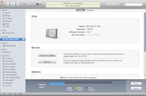
Interesting bad example would be iTunes. yes, I love my mac, after 12 years I can’t see my self going back to windows, but still, Apple made some arrogant mistakes in this area, iTunes is one of them. It’s the best music player in the market, I never used the itunes store to buy movies or TV shows, because for me itunes is for music, I would expect to find movies and such in Quicktime, but it didn’t really bother me. Then I got an iPod. syncing music from itunes forced apple to use an interface originally designed for playlists and songs for file system & disk utilities actions, this added a new kind of screen with new set of controls to the ones I already knew in iTunes, which immediately made the entire app a bit more scary.

And then I got an iPhone, and the AppStore, and then came Ping, and over and over again the whole iTunes experience was stretched to new areas. Why?
Wouldn’t it be easier for us users and you Apple to split this clutter into several existing applications? let iTunes play tunes, let iSync do sync and backup, let Quicktime play movies?
When one can not explain the benefit of the benefit users tend to ignore and move on.